Violin Plot with Statistical Annotations
Violin plots combine the benefits of box plots and density plots, showing both the distribution shape and summary statistics. The plot_violin_with_stats function creates publication-ready violin plots with built-in statistical tests and automatic p-value annotations.
Features
Distribution visualization: Shows the full distribution shape of your data
Statistical tests: Automatic ANOVA/Kruskal-Wallis and pairwise comparisons
Jittered points: Optional individual data points with different markers
Custom colors: Flexible color palette support
Publication-ready: Clean, professional appearance
Flexible ordering: Control the order of groups
Basic Usage
from ggpubpy import plot_violin_with_stats, load_iris
import matplotlib.pyplot as plt

# Load sample data
iris = load_iris()

# Create violin plot with statistical annotations (matches examples/violin_example.png)
fig, ax = plot_violin_with_stats(
    df=iris,
    x="species",
    y="sepal_length",
    x_label="Species",
    y_label="Sepal Length (cm)",
    title="Iris: Sepal Length by Species",
    subtitle="Violin plot with non-parametric tests",
    parametric=False,
    alpha=0.6,
)

plt.show()

Function Parameters
plot_violin_with_stats()
Parameters:
df(pd.DataFrame): Your datax(str): Column name for categories (must be categorical)y(str): Column name for numeric valuesx_label(str, optional): Axis label for x-axis. Defaults to column namey_label(str, optional): Axis label for y-axis. Defaults to column nametitle(str, optional): Overall plot titlesubtitle(str, optional): Plot subtitleorder(list, optional): Order of x categories. Defaults to sorted unique valuespalette(dict, optional): Mapping from category to colorfigsize(tuple): Figure size (default: (6, 6))add_jitter(bool): Whether to add jittered points (default: True)jitter_std(float): Standard deviation for horizontal jitter (default: 0.04)alpha(float, optional): Transparency for jittered points (default: 0.6)violin_width(float): Width of each violin in the plot (default: 0.6)global_test(bool): Whether to perform and display global statistical test (default: True)pairwise_test(bool): Whether to perform and display pairwise comparisons (default: True)parametric(bool): If True, use parametric tests (ANOVA + t-test). If False, use non-parametric tests (Kruskal-Wallis + Mann-Whitney U) (default: False)
Returns:
tuple: (figure, axes) matplotlib objects
Examples
Two Groups Example
from ggpubpy import plot_violin_with_stats, load_iris
import matplotlib.pyplot as plt

# Load Iris data (two groups: setosa vs versicolor)
iris = load_iris()
iris_2 = iris[iris["species"].isin(["setosa", "versicolor"])]

# Create violin plot comparing two groups (matches examples/violin_2groups_example.png)
fig, ax = plot_violin_with_stats(
    df=iris_2,
    x="species",
    y="sepal_length",
    x_label="Species",
    y_label="Sepal Length (cm)",
    title="Iris: Setosa vs Versicolor",
    subtitle="Violin plot with t-test",
    parametric=True,
    alpha=0.6,
)

plt.show()

Three Groups Example
from ggpubpy import plot_violin_with_stats, load_iris
import matplotlib.pyplot as plt

# Load Iris data
iris = load_iris()

# Create violin plot with three groups
fig, ax = plot_violin_with_stats(
    df=iris,
    x="species",
    y="petal_length",
    x_label="Species",
    y_label="Petal Length (cm)",
    title="Petal Length Distribution by Species",
    order=["setosa", "versicolor", "virginica"],
    palette={"setosa": "#FF6B6B", "versicolor": "#4ECDC4", "virginica": "#45B7D1"},
    figsize=(8, 6),
    parametric=True  # Use parametric tests
)

plt.show()

Custom Styling Example
from ggpubpy import plot_violin_with_stats, load_iris
import matplotlib.pyplot as plt

# Load Iris data
iris = load_iris()

# Create custom styled violin plot
fig, ax = plot_violin_with_stats(
    df=iris,
    x="species",
    y="sepal_width",
    x_label="Species",
    y_label="Sepal Width (cm)",
    title="Sepal Width Distribution",
    subtitle="Statistical comparison across species",
    order=["setosa", "versicolor", "virginica"],
    palette={"setosa": "#E74C3C", "versicolor": "#F39C12", "virginica": "#27AE60"},
    figsize=(10, 7),
    add_jitter=True,
    jitter_std=0.05,
    violin_width=0.7,
    global_test=True,
    pairwise_test=True,
    parametric=False
)

plt.show()
When to Use Violin Plots
Violin plots are particularly useful when you want to:
Compare distributions: See the full shape of data distributions across groups
Identify multimodality: Detect multiple peaks or modes in your data
Visualize skewness: Understand the asymmetry of your distributions
Small sample sizes: Better representation of data when you have limited observations
Publication quality: Professional appearance suitable for scientific publications
Statistical Tests
The function automatically performs appropriate statistical tests:
Global Test
Parametric: One-way ANOVA
Non-parametric: Kruskal-Wallis test
Pairwise Comparisons
Parametric: Independent t-tests with multiple comparison correction
Non-parametric: Mann-Whitney U tests with multiple comparison correction
Significance Levels
***p < 0.001**p < 0.01*p < 0.05nsp ≥ 0.05
Violin vs Box Plot
Feature |
Violin Plot |
Box Plot |
|---|---|---|
Distribution shape |
✅ Shows full density |
❌ Only quartiles |
Outliers |
❌ Not explicitly shown |
✅ Clearly marked |
Sample size |
✅ Width indicates density |
❌ No indication |
Multimodality |
✅ Easy to detect |
❌ Not visible |
Skewness |
✅ Clear visualization |
❌ Limited information |
Tips
Choose appropriate tests: Use parametric tests for normally distributed data, non-parametric for skewed data
Custom colors: Provide a palette dictionary for consistent coloring
Jitter points: Help visualize individual data points and sample sizes
Order groups: Use the
orderparameter to control the sequence of groupsFigure size: Adjust
figsizebased on the number of groups and your publication requirementsViolin width: Adjust
violin_widthto control the visual impact of the density curves
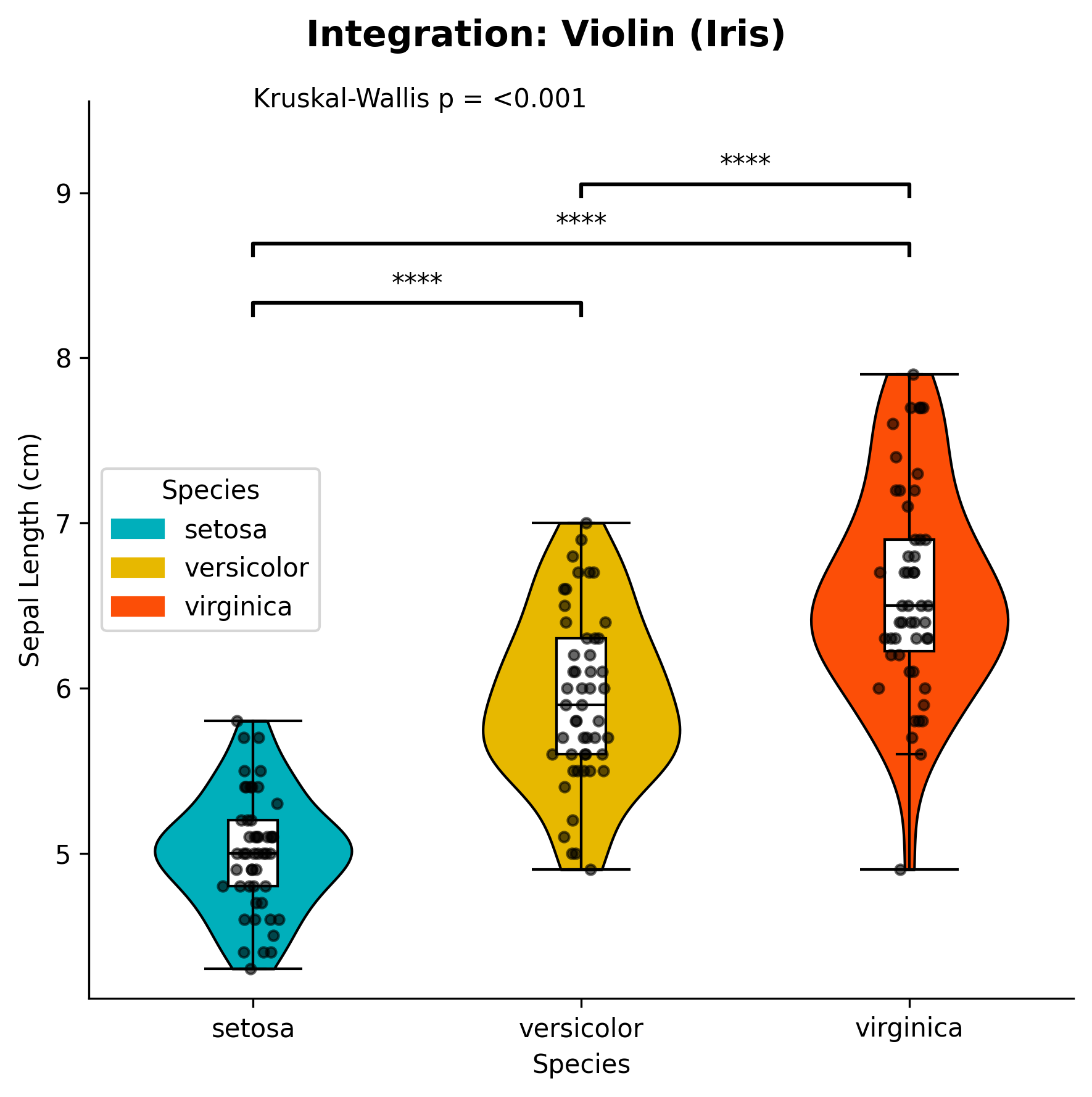
Integration
The violin plot function integrates seamlessly with other ggpubpy functions:
from ggpubpy import plot_violin_with_stats, plot_boxplot_with_stats, load_iris

# Create multiple plots for comparison
iris = load_iris()

# Violin plot
fig1, ax1 = plot_violin_with_stats(iris, "species", "sepal_length")

# Box plot
fig2, ax2 = plot_boxplot_with_stats(iris, "species", "sepal_length")
Note: The figures on this page are generated by running examples/violinplot_examples.py and examples/violinplot_extra_examples.py using identical parameters.