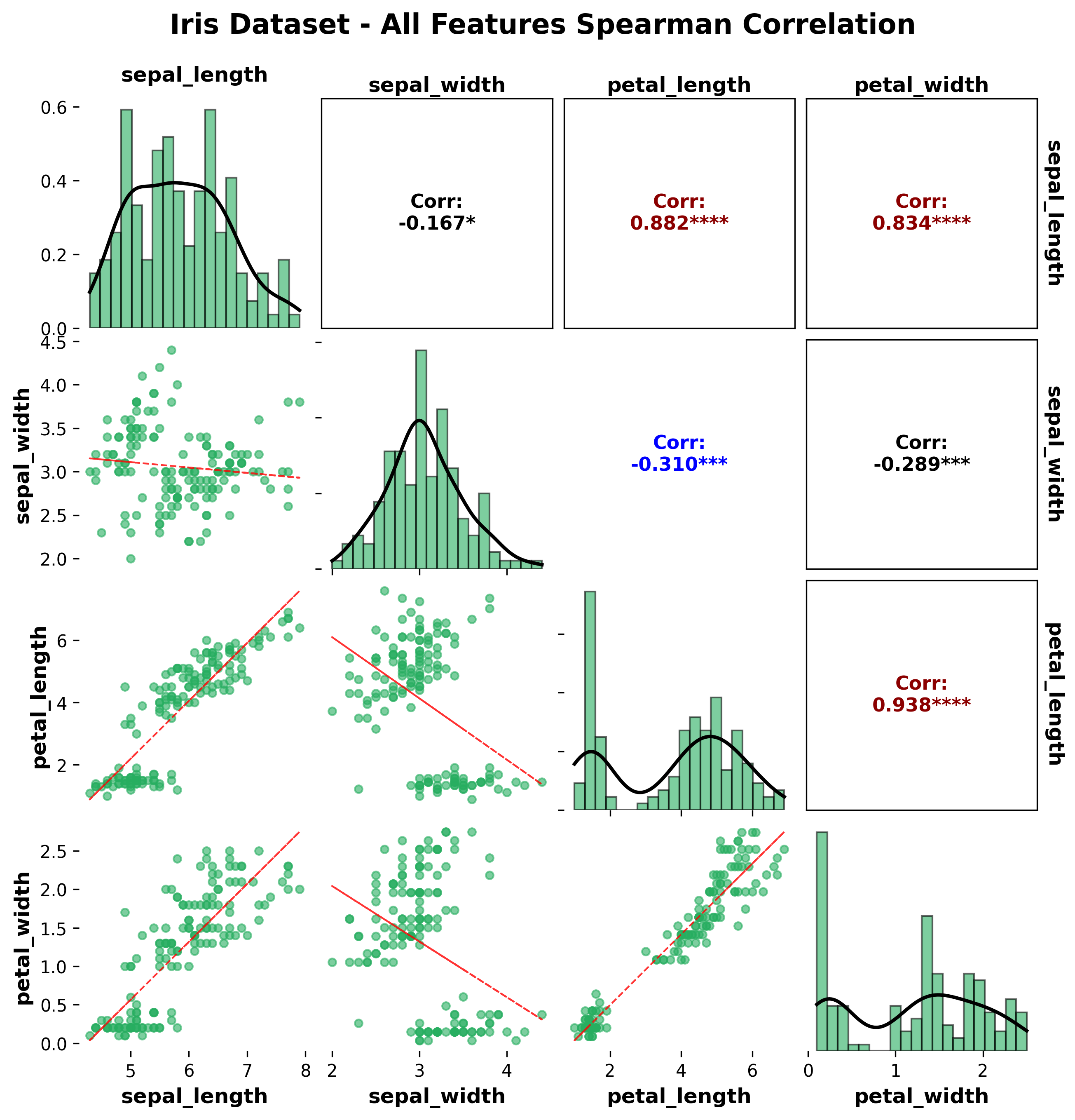
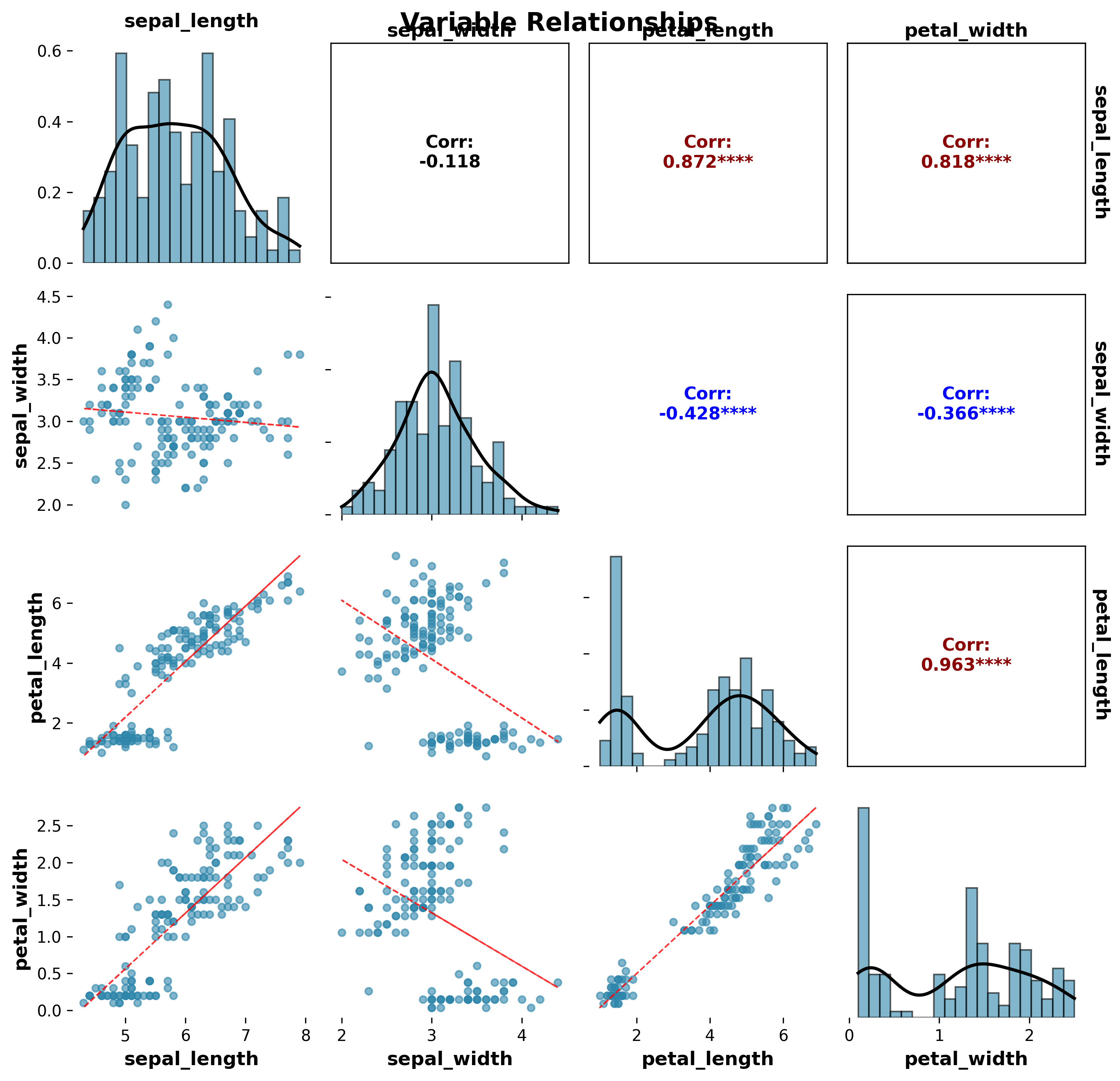
Correlation Matrix Plot
Correlation matrix plots provide a comprehensive visualization of relationships between multiple variables. The plot_correlation_matrix function creates publication-ready correlation matrices with scatter plots, correlation values, and statistical significance indicators.
Features
Scatter plot matrix: Shows pairwise relationships between variables
Correlation values: Displays correlation coefficients with significance levels
Statistical significance: Indicates significant correlations with symbols
Custom colors: Flexible color palette support
Publication-ready: Clean, professional appearance
Multiple datasets: Support for different datasets and synthetic data
Basic Usage
from ggpubpy import plot_correlation_matrix, load_iris
import matplotlib.pyplot as plt
# Load sample data
iris = load_iris()
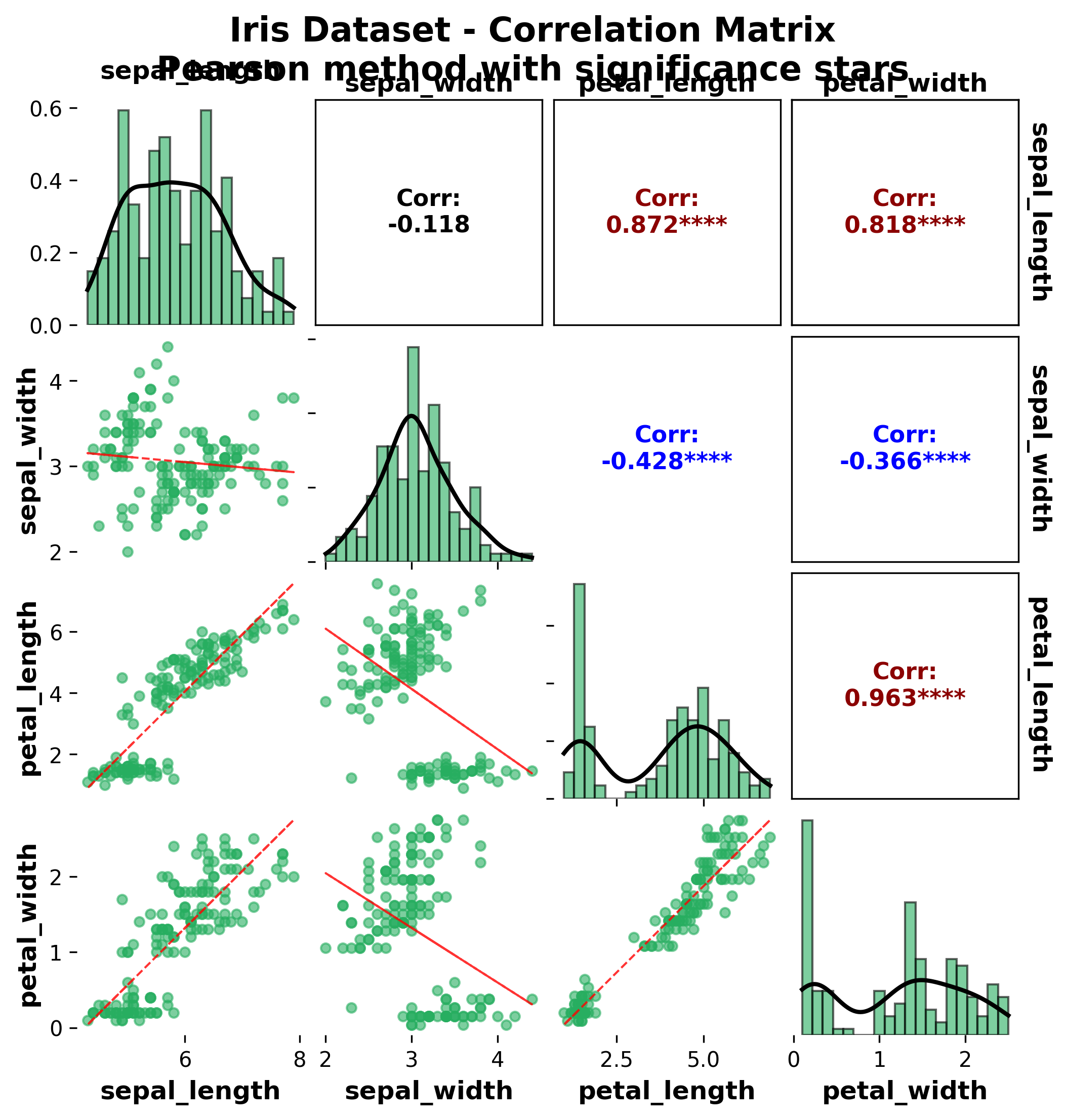
# Create correlation matrix plot (matches examples/correlation_matrix_example.png)
fig, axes = plot_correlation_matrix(
df=iris,
columns=['sepal_length', 'sepal_width', 'petal_length', 'petal_width'],
figsize=(8, 8),
color="#27AE60",
alpha=0.6,
point_size=20,
show_stats=True,
method="pearson",
title="Iris Dataset - Correlation Matrix",
subtitle="Pearson method with significance stars",
)
plt.show()
Function Parameters
plot_correlation_matrix()
Parameters:
df(pd.DataFrame): Input datacolumns(list, optional): List of column names to include. If None, uses all numeric columnsfigsize(tuple): Figure size (default: (10, 10))color(str): Color for scatter points (default: ‘#2E86AB’)alpha(float): Transparency for scatter points (default: 0.6)point_size(float): Scatter point size (default: 20)show_stats(bool): Whether to show significance stars (default: True)method(str): Correlation method (‘pearson’, ‘spearman’, ‘kendall’) (default: ‘pearson’)title(str, optional): Plot titlesubtitle(str, optional): Plot subtitle
Returns:
tuple: (figure, axes_array) matplotlib objects
Examples
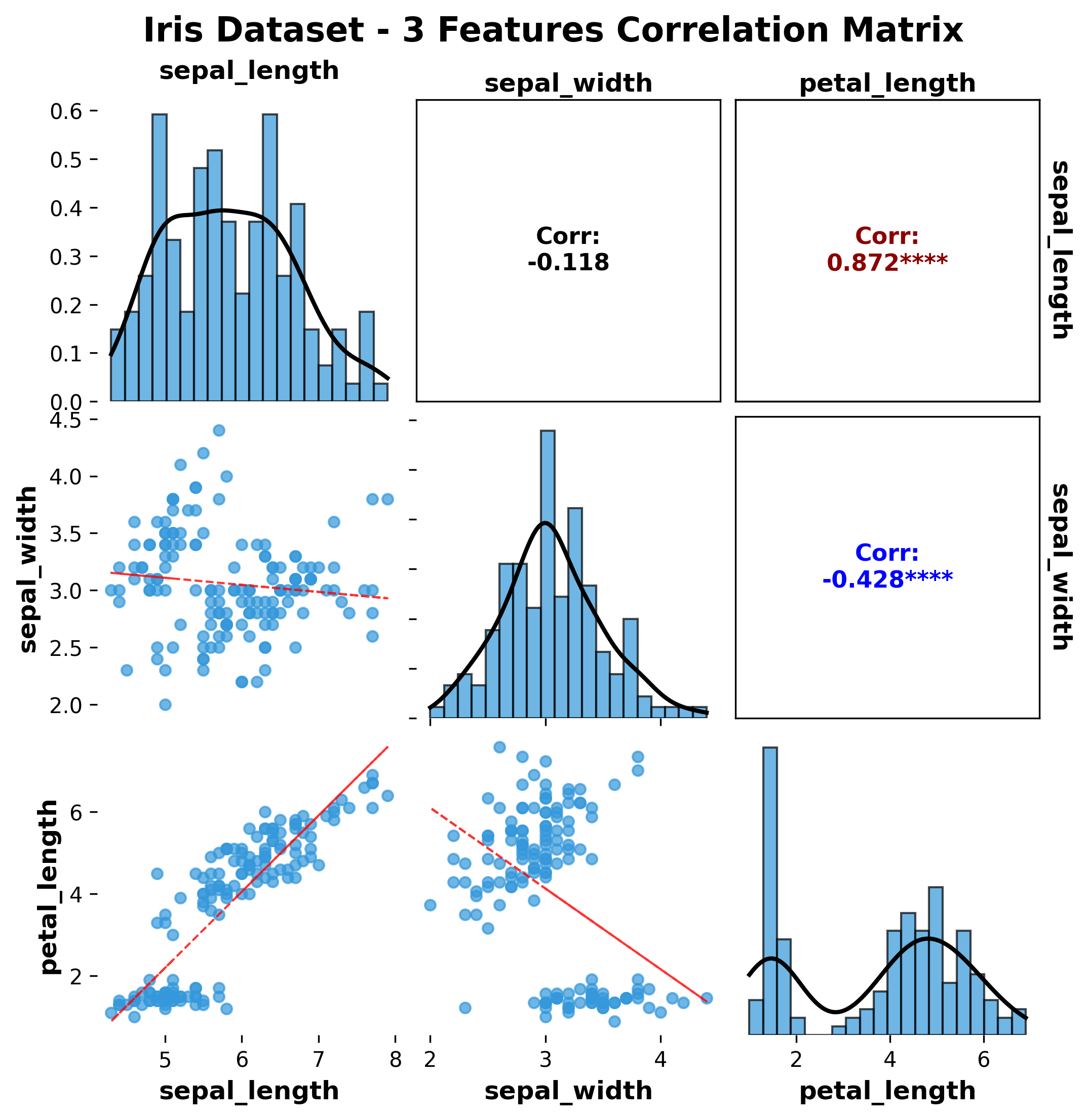
Iris Dataset - 3 Features
from ggpubpy import plot_correlation_matrix, load_iris
import matplotlib.pyplot as plt

# Load Iris data
iris = load_iris()

# Create correlation matrix with 3 features
fig, axes = plot_correlation_matrix(
    df=iris,
    columns=['sepal_length', 'sepal_width', 'petal_length'],
    title="Iris Dataset - 3 Features Correlation Matrix",
    figsize=(8, 6)
)

plt.show()
Iris Dataset - 4 Features
from ggpubpy import plot_correlation_matrix, load_iris
import matplotlib.pyplot as plt

# Load Iris data
iris = load_iris()

# Create correlation matrix with all 4 features
fig, axes = plot_correlation_matrix(
    df=iris,
    columns=['sepal_length', 'sepal_width', 'petal_length', 'petal_width'],
    title="Iris Dataset - Complete Correlation Matrix",
    figsize=(10, 8),
    alpha=0.7,
    method='pearson'
)

plt.show()
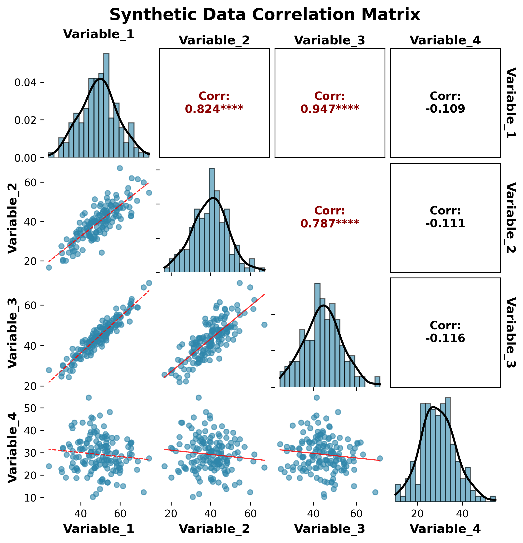
Synthetic Data Example
from ggpubpy import plot_correlation_matrix
import matplotlib.pyplot as plt
import pandas as pd
import numpy as np

# Create synthetic data with known correlations
np.random.seed(42)
n = 100

# Generate correlated variables
x1 = np.random.normal(0, 1, n)
x2 = 0.7 * x1 + np.random.normal(0, 0.7, n)  # Strong positive correlation
x3 = -0.5 * x1 + np.random.normal(0, 0.8, n)  # Moderate negative correlation
x4 = np.random.normal(0, 1, n)  # Independent variable

# Create DataFrame
synthetic_data = pd.DataFrame({
    'Variable_A': x1,
    'Variable_B': x2,
    'Variable_C': x3,
    'Variable_D': x4
})

# Create correlation matrix plot
fig, axes = plot_correlation_matrix(
    df=synthetic_data,
    title="Synthetic Data Correlation Matrix",
    subtitle="Demonstrating different correlation strengths",
    figsize=(10, 8),
    alpha=0.6,
    method='pearson'
)

plt.show()
Custom Styling Example
from ggpubpy import plot_correlation_matrix, load_iris
import matplotlib.pyplot as plt

# Load Iris data
iris = load_iris()

# Create custom styled correlation matrix
fig, axes = plot_correlation_matrix(
    df=iris,
    columns=['sepal_length', 'sepal_width', 'petal_length', 'petal_width'],
    title="Custom Styled Correlation Matrix",
    figsize=(12, 10),
    alpha=0.5,
    method='spearman',
    show_stats=True
)

# Add custom annotations on the top-left subplot
ax = axes[0, 0]
ax.text(0.5, 1.02, 'Spearman correlation coefficients',
        transform=ax.transAxes, ha='center', fontsize=12,
        bbox=dict(boxstyle="round,pad=0.3", facecolor="lightblue", alpha=0.7))

plt.show()
Correlation Methods
Pearson Correlation
Use case: Linear relationships, normally distributed data
Range: -1 to +1
Interpretation: Linear correlation strength
Spearman Correlation
Use case: Monotonic relationships, non-parametric
Range: -1 to +1
Interpretation: Rank-based correlation strength
Kendall Correlation
Use case: Ordinal data, small sample sizes
Range: -1 to +1
Interpretation: Concordance between rankings
Significance Levels
The plot shows significance symbols:
***p < 0.001**p < 0.01*p < 0.05No symbol: p ≥ significance_level
Interpretation Guide
Correlation Strength
|r| > 0.8: Very strong correlation
0.6 < |r| ≤ 0.8: Strong correlation
0.4 < |r| ≤ 0.6: Moderate correlation
0.2 < |r| ≤ 0.4: Weak correlation
|r| ≤ 0.2: Very weak or no correlation
Visual Elements
Scatter plots: Show the actual data points and relationship shape
Correlation values: Numerical correlation coefficients
Color intensity: Reflects correlation strength
Significance symbols: Indicate statistical significance
When to Use Correlation Matrices
Correlation matrices are useful for:
Exploratory data analysis: Understanding variable relationships
Feature selection: Identifying highly correlated variables
Multicollinearity detection: Finding problematic correlations
Data quality assessment: Checking for unexpected relationships
Publication figures: Professional visualization of correlations
Tips
Choose appropriate method: Use Pearson for linear relationships, Spearman for monotonic
Handle missing data: Ensure data is complete or handle missing values appropriately
Sample size: Larger samples provide more reliable correlation estimates
Outliers: Be aware of outliers that might inflate or deflate correlations
Multiple comparisons: Consider adjusting significance levels for multiple tests
Color schemes: Choose color maps that are accessible and publication-friendly
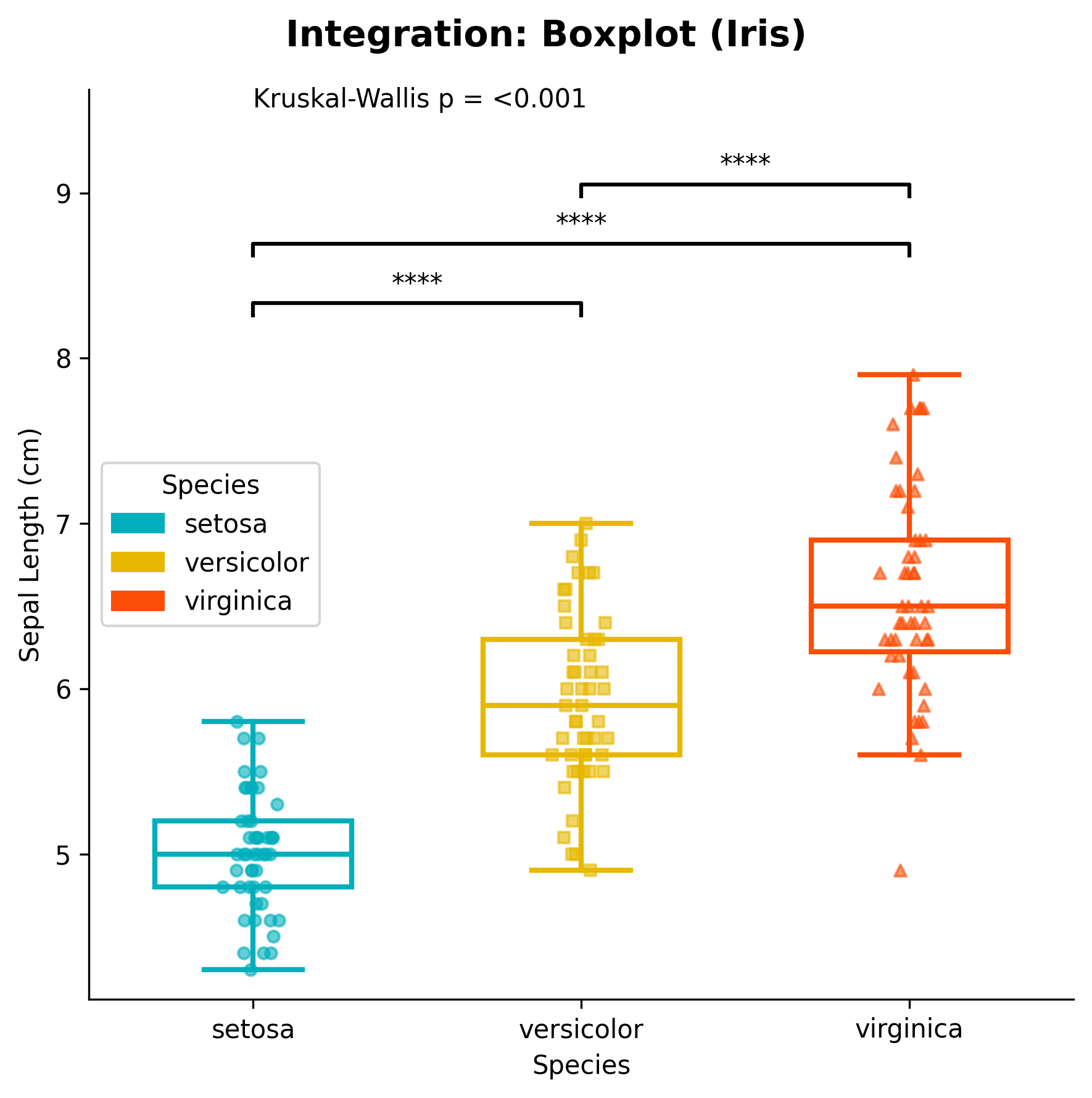
Integration
The correlation matrix function integrates seamlessly with other ggpubpy functions:
from ggpubpy import plot_correlation_matrix, plot_boxplot_with_stats, load_iris

# Load data
iris = load_iris()

# Correlation matrix for overall relationships
fig1, axes1 = plot_correlation_matrix(iris, title="Variable Relationships")

# Box plots for individual variable distributions
fig2, ax2 = plot_boxplot_with_stats(iris, "species", "sepal_length")
Advanced Usage
Custom Correlation Analysis
from ggpubpy import plot_correlation_matrix
import pandas as pd
import numpy as np
from scipy.stats import pearsonr

# Create custom data
np.random.seed(42)
data = pd.DataFrame({
    'X1': np.random.normal(0, 1, 50),
    'X2': np.random.normal(0, 1, 50),
    'X3': np.random.normal(0, 1, 50)
})

# Add some correlation
data['X2'] = 0.6 * data['X1'] + 0.8 * data['X2']
data['X3'] = -0.4 * data['X1'] + 0.9 * data['X3']

# Create plot
fig, axes = plot_correlation_matrix(
    df=data,
    title="Custom Correlation Analysis",
    method='pearson'
)

# Add custom statistical information
corr_matrix = data.corr()
n = len(data)

# Add note on the first subplot
ax = axes[0, 0]
ax.text(0.02, 0.98, f'Sample size: n = {n}\nMethod: Pearson correlation',
        transform=ax.transAxes, fontsize=10, verticalalignment='top',
        bbox=dict(boxstyle="round,pad=0.3", facecolor="lightgreen", alpha=0.7))
Note: The figures on this page are generated by running `examples/correlation_matrix_example.py` and `examples/correlation_matrix_extra_examples.py` using identical parameters.

plt.show()