Alluvial Plots in ggpubpy
Alluvial plots (also known as flow diagrams) are a type of visualization that shows how data flows between different categorical dimensions. They are particularly useful for showing relationships and transitions between categories.
Features
Flow visualization: Shows how data moves between categorical dimensions
Customizable colors: Color flows by any categorical variable
Flexible ordering: Control the order of categories in each dimension
Publication-ready: Clean, professional appearance suitable for publications
Statistical integration: Ready for future statistical enhancements
Bézier curves: Smooth, aesthetically pleasing flow connections
Basic Usage
from ggpubpy import plot_alluvial, load_titanic
import pandas as pd
import numpy as np
import matplotlib.pyplot as plt
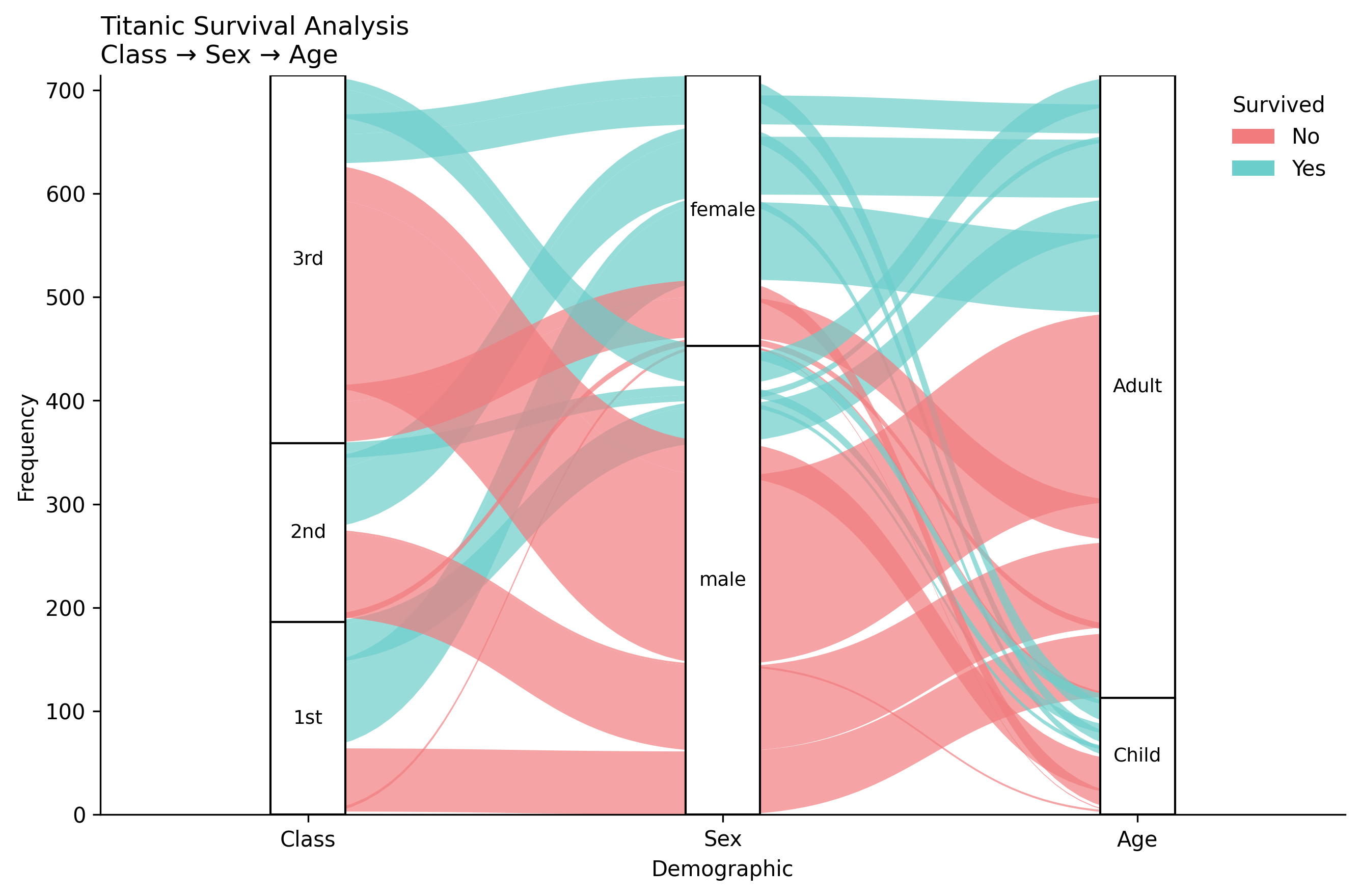
# Load and prepare data
titanic = load_titanic()
titanic = titanic.dropna(subset=["Age"])
titanic["Class"] = titanic["Pclass"].map({1: "1st", 2: "2nd", 3: "3rd"})
titanic["AgeCat"] = np.where(titanic["Age"] < 18, "Child", "Adult")
titanic["Survived"] = titanic["Survived"].astype(str).replace({"0": "No", "1": "Yes"})
# Create frequency table with alluvium IDs
titanic_tab = (titanic.groupby(["Class", "Sex", "AgeCat", "Survived"]) \
.size() \
.reset_index(name="Freq") \
.rename(columns={"AgeCat": "Age"}))
titanic_tab["alluvium"] = titanic_tab.index
# Create alluvial plot (matches examples/alluvial_examples.py)
fig, ax = plot_alluvial(
titanic_tab,
dims=["Class", "Sex", "Age"],
value_col="Freq",
color_by="Survived",
id_col="alluvium",
orders={
"Class": ["1st", "2nd", "3rd"],
"Sex": ["male", "female"],
"Age": ["Child", "Adult"],
},
color_map={"No": "#F17C7E", "Yes": "#6CCECB"},
title="Titanic Survival Analysis",
subtitle="Class → Sex → Age",
alpha=0.7,
)
plt.show()
Functions
plot_alluvial()
Creates a basic alluvial plot with flow diagrams between categorical dimensions.
Parameters:
df: DataFrame containing the datadims: List of column names representing the dimensions (axes) of the flowvalue_col: Column name containing the frequency/weight valuescolor_by: Column name to use for coloring the flowsid_col: Column name containing unique identifiers for each floworders: Optional dictionary mapping dimension names to ordered category listscolor_map: Optional dictionary mapping category values to colorstitle: Main title for the plotsubtitle: Subtitle for the plotfigsize: Figure size in inches (default: (9, 6))alpha: Transparency level for flow polygons (default: 0.8)x_label: Label for x-axis (default: “Demographic”)y_label: Label for y-axis (default: “Frequency”)
plot_alluvial_with_stats()
Creates an alluvial plot with optional statistical annotations. Currently identical to plot_alluvial() but provides a consistent interface for future statistical enhancements.
Examples
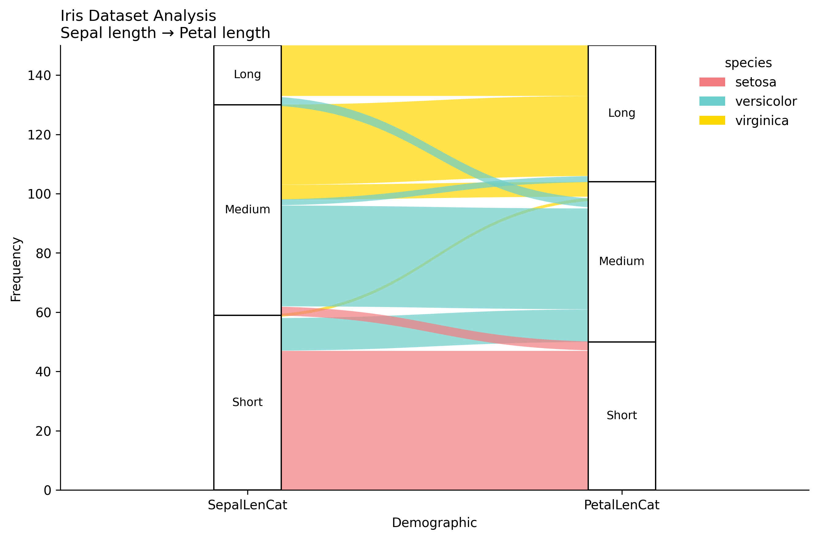
Iris Dataset Example
from ggpubpy import plot_alluvial, load_iris
import pandas as pd
import matplotlib.pyplot as plt

# Load Iris data
iris = load_iris()

# Create categorical variables from continuous ones
iris["SepalLenCat"] = pd.cut(iris["sepal_length"], bins=3, labels=["Short", "Medium", "Long"])
iris["PetalLenCat"] = pd.cut(iris["petal_length"], bins=3, labels=["Short", "Medium", "Long"])

# Create frequency table with alluvium IDs
iris_tab = (iris.groupby(["SepalLenCat", "PetalLenCat", "species"], observed=True)
            .size()
            .reset_index(name="Freq"))
iris_tab["alluvium"] = iris_tab.index

# Create alluvial plot
fig, ax = plot_alluvial(
    iris_tab,
    dims=["SepalLenCat", "PetalLenCat"],
    value_col="Freq",
    color_by="species",
    id_col="alluvium",
    orders={"SepalLenCat": ["Short", "Medium", "Long"],
            "PetalLenCat": ["Short", "Medium", "Long"]},
    title="Iris Dataset Analysis",
    subtitle="Sepal length → Petal length",
    alpha=0.7
)

plt.show()
Complete Examples
Note: The figures on this page are generated by running examples/alluvial_examples.py using identical parameters.
See examples/alluvial_examples.py for complete examples including:
Titanic survival analysis
Iris dataset analysis
Custom employee performance data
Data Requirements
Your data should be in a “long” format with:
Dimensions: Categorical columns representing the flow axes
Values: A numeric column representing the frequency/weight of each flow
Colors: A categorical column for coloring the flows
IDs: A unique identifier for each flow (alluvium)
Tips
Data preparation: Create frequency tables using
groupby().size()orgroupby().sum()Alluvium IDs: Add a unique identifier column (e.g.,
df["alluvium"] = df.index)Category ordering: Use the
ordersparameter to control the sequence of categoriesColor schemes: Provide custom
color_mapfor consistent coloring across plotsTransparency: Adjust
alphato control flow visibility and overlapping
Integration
The alluvial plot functions are fully integrated into the ggpubpy package and can be imported alongside other plotting functions:
from ggpubpy import plot_alluvial, plot_boxplot, plot_violin